
Turning a tired brand into one that stands out
The brief
Amare Safety sold safety gear and workwear from eight stores around the country. Good products, good people, and a brand that had run out of puff. The owners wanted to double the business.
You don't double a business with a brand that looks like everyone else's. Safety gear is bought by people who need to trust it, and the brand needs to look like it can be trusted.
What was wrong
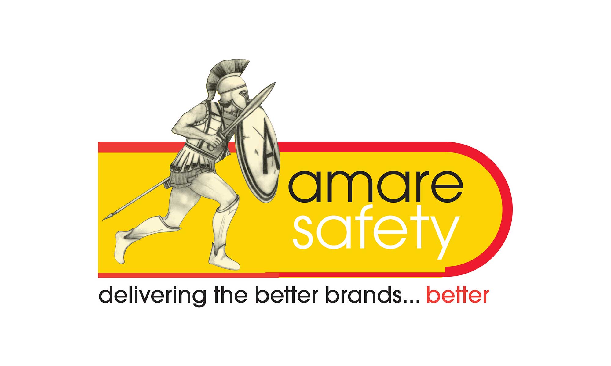
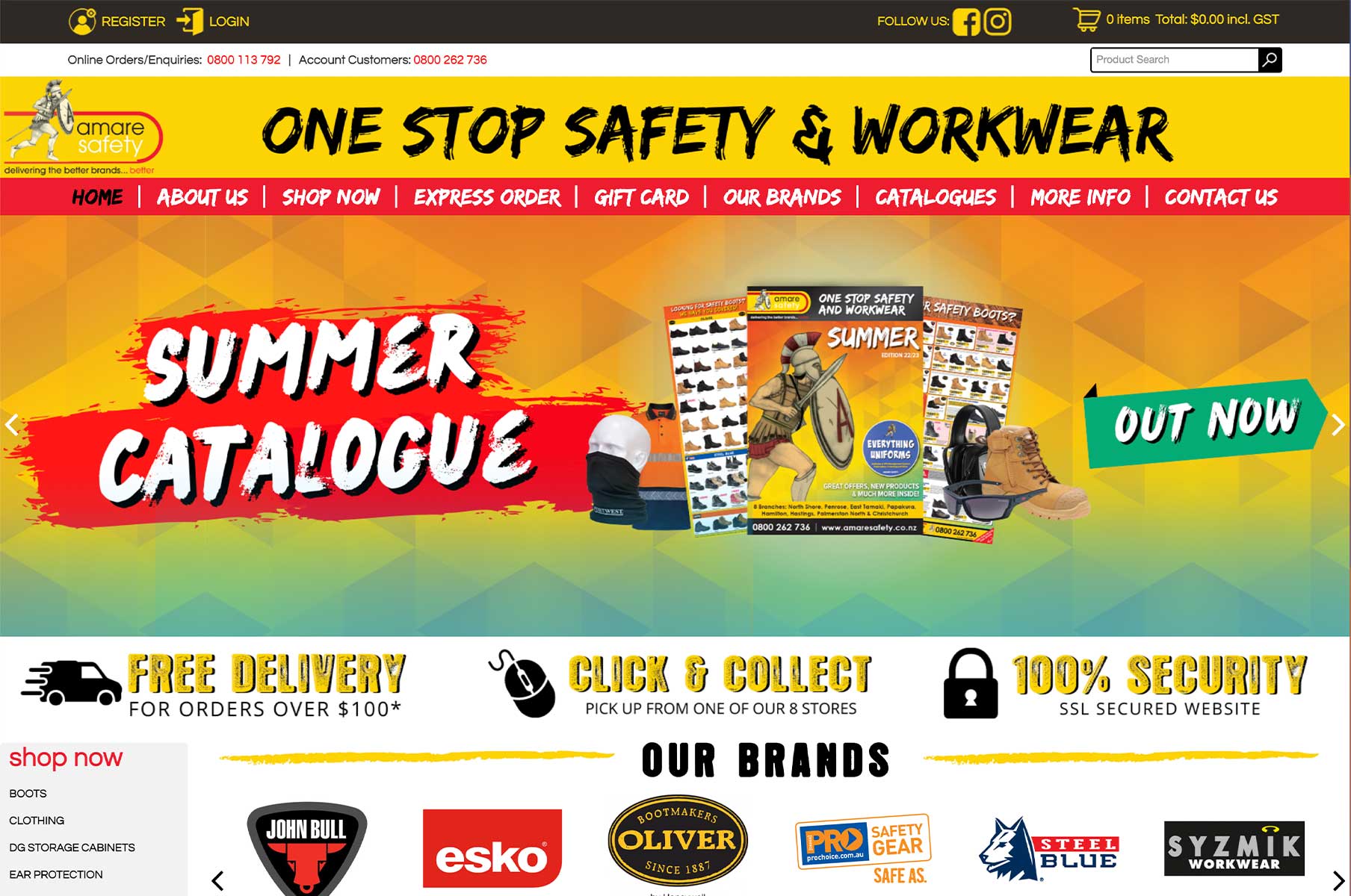
The old brand was a Roman soldier, a yellow and red banner and the line "delivering the better brands... better". It was busy, it was dated, and it was fighting itself. The mascot said ancient history. The colours said clearance sale. Nothing about it said the gear would keep you safe at work.
The new brand
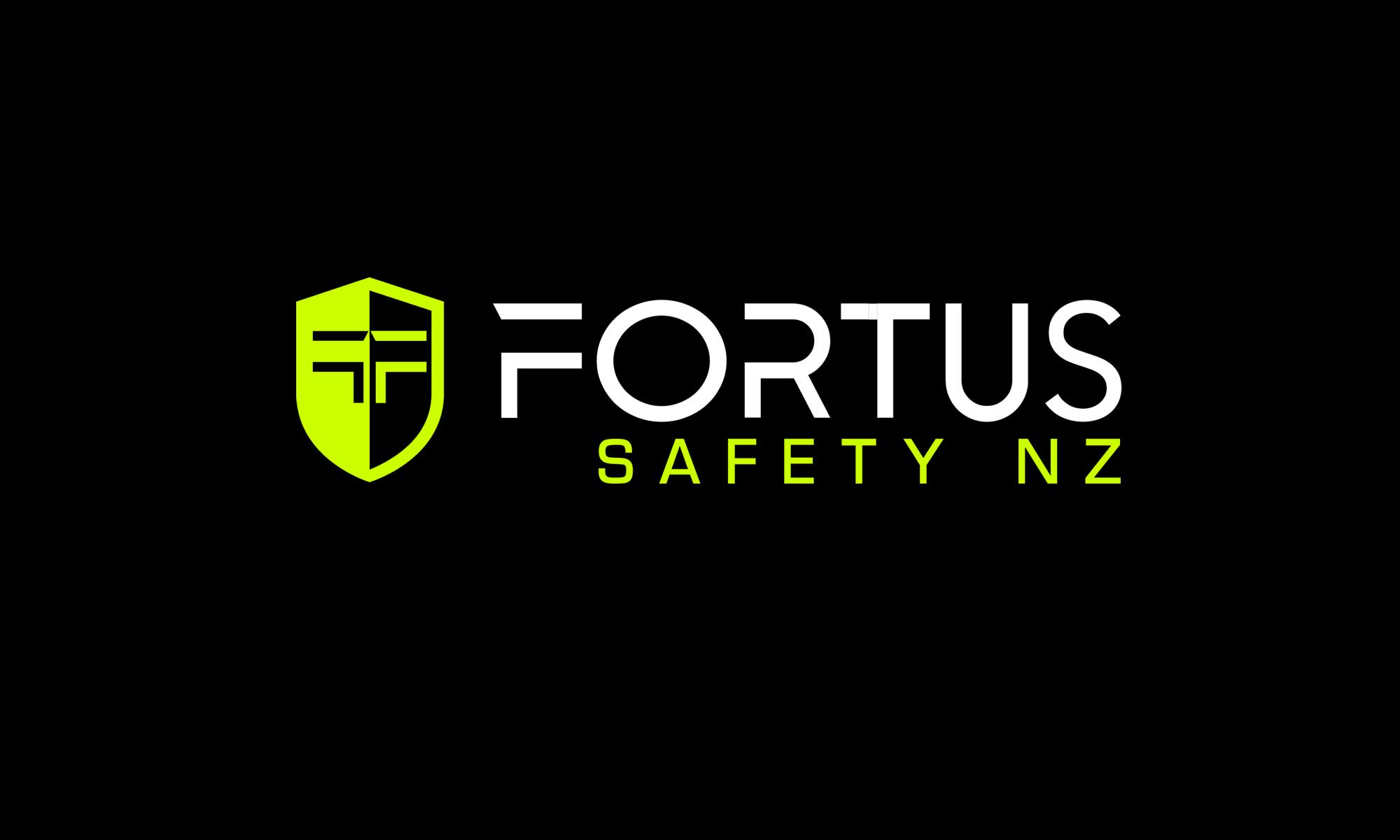
Fortus comes from the Latin for strong. It's short, it's easy to say on the phone, and it means something.
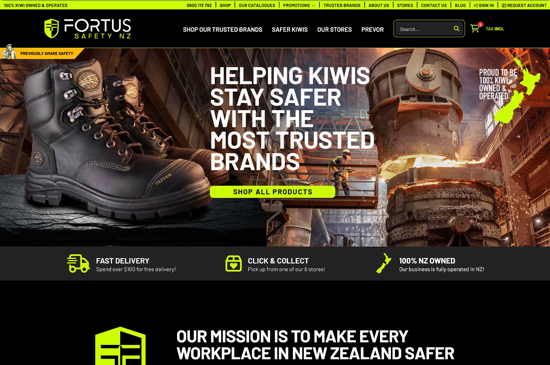
The mark is a shield, because that's the whole job of safety gear. Inside it sits an F, split down the middle: one half the protection, one half the person. The colours are the ones you already see on a work site: black, and the high-vis green that makes someone visible from across a yard. On a shelf full of yellow and orange, it stands out.
The voice changed too. Less selling, more purpose. The brand's job now is to help New Zealanders get home safely, and everything it says comes back to that.
Rolling it out
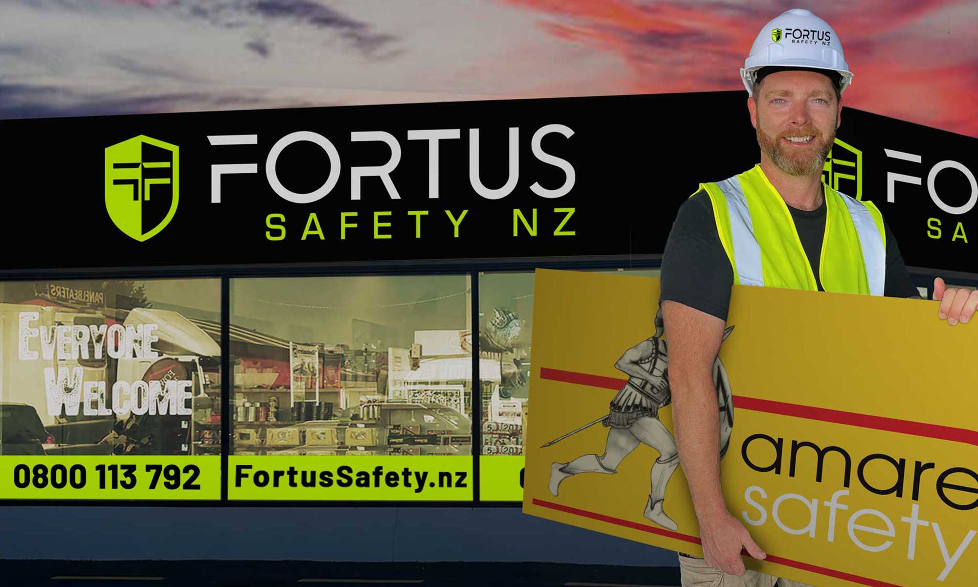
A brand is only real once people see it. That meant taking it everywhere at once: the website, the catalogues that go out to customers, the signage across all eight stores, and everything in between.
I directed the new website and oversaw the build, so what went live matched what the brand was meant to be.
What it shows
A rebrand isn't a new logo. It's working out what a business actually stands for, then making sure everything a customer sees says the same thing. Amare sold safety gear. Fortus helps Kiwis get home safely. Same products, completely different business.